Why the visual quality of a website affects trust, perception and, in the end, the way we interact with the digital world.
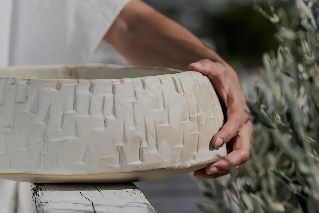
Hyle Ceramics. Website by Fabulous.
A first impression is never just an impression
Imagine two websites offering exactly the same service. The first has careful typography, a balanced composition, well-chosen photographs and a clear visual hierarchy. The second holds the same information, but its colours are inconsistent, it has little white space and its layout is cluttered.
Which one would we trust more? Our preference is not necessarily based on an objective judgement of the quality of their services. It is based, to a large extent, on what we see.
Online, aesthetics works as a first filter. Before we read a line of text or look for a piece of information, we have already started to form an opinion about how reliable and professional the business is. That first judgement can colour the whole experience that follows.
When beauty is perceived as usability
In user experience there is a phenomenon known as the aesthetic-usability effect. It describes our tendency to perceive attractive products as easier to use, even when they do not actually work any better.
It was studied in 1995 by the Japanese researchers Masaaki Kurosu and Kaori Kashimura. In their study, 252 participants rated 26 different layouts of an ATM interface. The results showed that aesthetics had a strong influence on how easy to use the participants believed each layout was.
This does not mean that beauty automatically improves usability. It means that beauty changes how we perceive it. And that distinction matters enormously in web design.
Aesthetics as a language of trust
Every design choice carries a message. A strict typographic composition can feel serious. A generous use of white space can feel calm and confident. A distinctive photographic direction can speak of creativity or exclusivity.
Take a boutique hotel. A website with large, atmospheric photographs, discreet typography and a limited palette can convey the feeling of a carefully considered stay. The same business, with a crowded website, many colours and effects used without restraint, may leave a completely different impression.
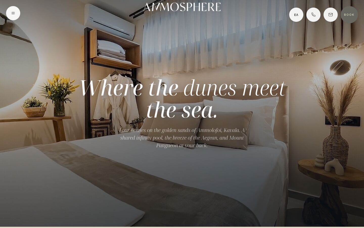
The product has not changed. What has changed is the way it is presented and, therefore, the way it is perceived. Visual design does not simply present a brand’s identity. It takes an active part in shaping it.
White space is not empty space
A common mistake in web design is the belief that every available spot on the screen has to be used: more elements, more information, more messages. But visual density is not the same as effective communication.
White space, or negative space, is one of the most important tools for organising what we see. It creates relationships between elements, separates sections and lets the eye recognise the hierarchy of information more easily.
A page with one large title, a short paragraph and a single photograph can do more than a page full of cards, icons, coloured boxes and several calls to action. Not because minimal design is better by definition, but because reduction, when it is deliberate, sharpens attention.
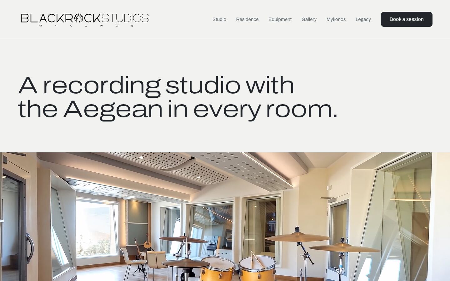
Good design does not try to fill the space. It tries to give it meaning.
Typography as personality
Typography is often treated as a technical decision: which typeface is legible, which size is right, which weight to use for headings. In fact, it is one of the most expressive tools in digital design.
A geometric sans-serif can feel modern and technological. A refined serif can suggest tradition, culture or luxury. But choosing the typeface is only the beginning.
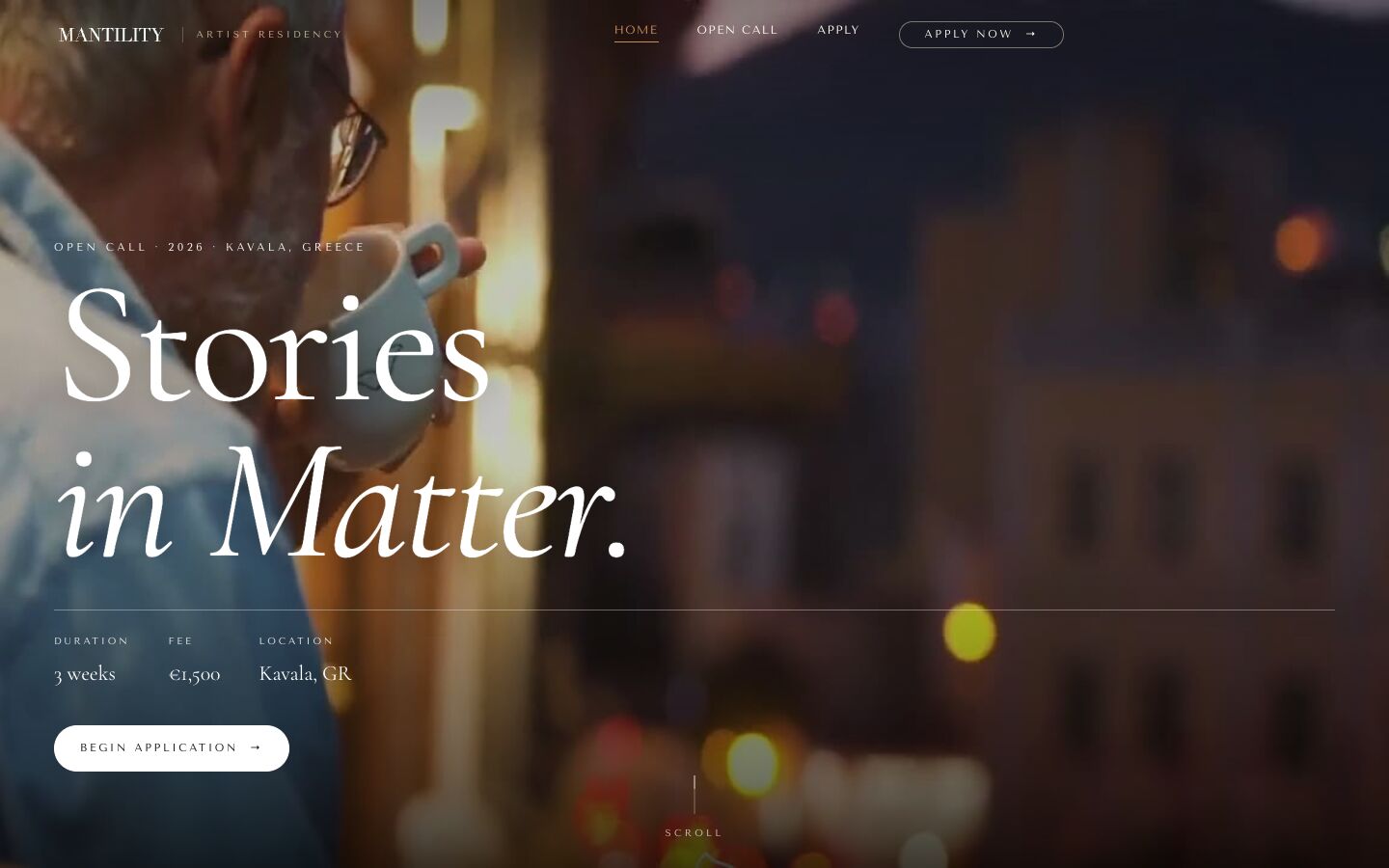

The relationship between sizes, the line spacing, the length of the lines and the space between paragraphs all shape the reading experience. Typography is not only about how words look. It is about how we live through reading them.
The trouble with spectacle
Animations, parallax effects, elaborate transitions, interactive elements and striking visual storytelling can turn a website into a memorable experience. There is, however, an important trap: what technology makes possible is not, on its own, a design argument.
Being able to add an animation does not mean we should. A spectacular opening screen may delight on the first visit. But if it delays access to the content, or repeats needless movement, the first impression can turn into irritation.
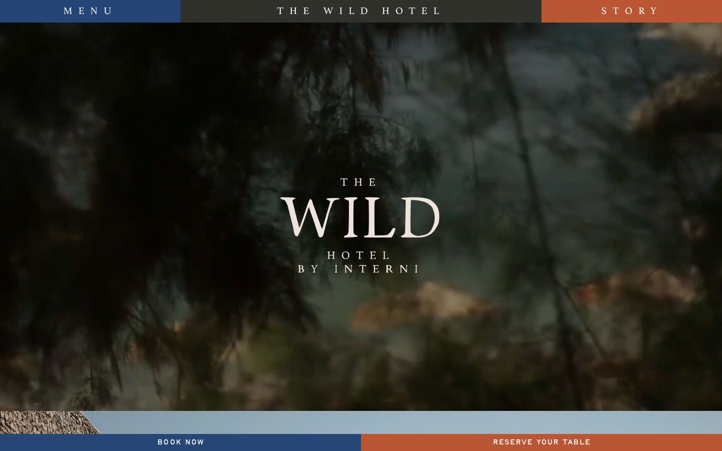
The real challenge is not to make something that grabs attention. It is to make something that still works well once the first surprise has worn off.
The fine balance between aesthetics and usability
For years, the conversation about web design was often framed as a contest between aesthetics and function. In reality, it is a false distinction. A well-designed website does not have to choose between the two.
Visual hierarchy can guide navigation. Colour contrast can improve legibility. Consistent typography can make content easier to understand. Even the choice of photographs can help a visitor understand a service or a product better.
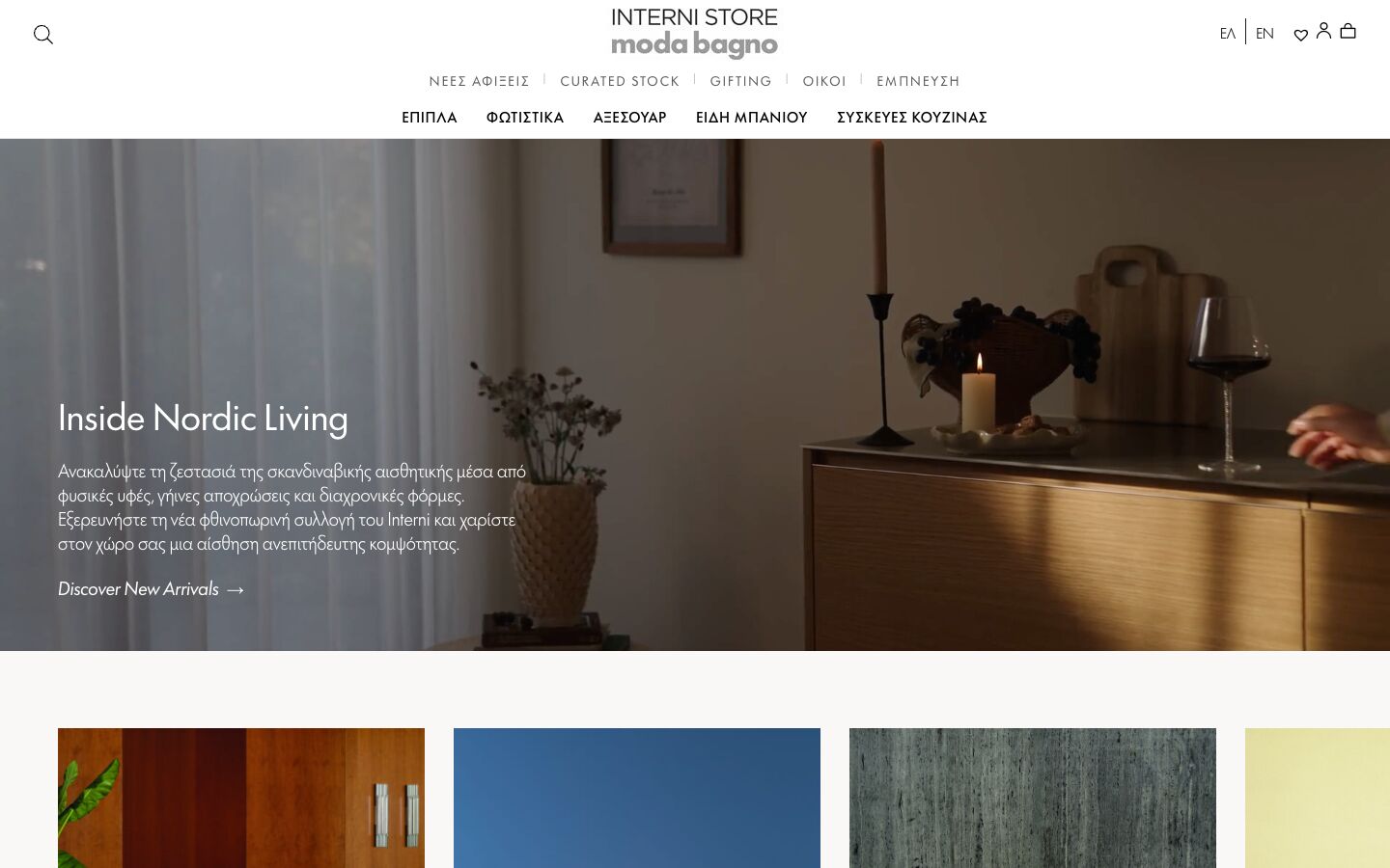
Aesthetics is not added afterwards on top of a working structure. It is an inseparable part of it.
Design is not personal taste
One of the biggest challenges in professional design is the habit of judging everything by our own taste: “I prefer blue”, “I’d like the title bigger”, “The page feels too empty”.
Remarks like these are natural. On their own, though, they are not enough to design by. Every creative decision has to be weighed against the audience, the identity and the goals of the project.
A website for an architecture practice does not need to speak like an electronics shop. A cultural platform can play with experimental typography, while a payments app usually needs clarity and predictability.
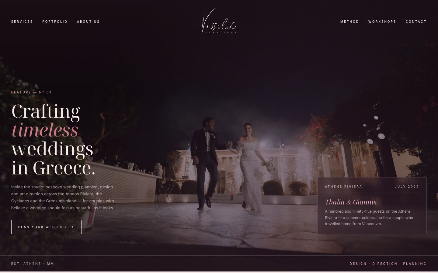
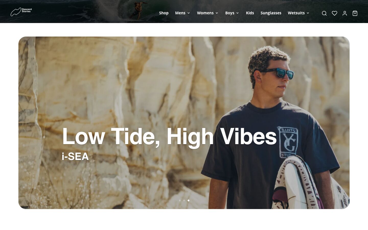
Good design comes from understanding the problem it has to solve. And that takes judgement.
How do we measure whether a design works?
Visual quality can be a strong advantage, but it is not enough to prove that a website is successful. We also need to look at how visitors actually behave.
Can they easily find what they are looking for? Do they understand what the business offers? Can they complete a purchase or get in touch without needless friction? Does the experience hold up across different devices?
These questions call for testing, observation and evaluation. A website can collect compliments for its looks and still have serious navigation problems. What matters is not only what users say, but what they actually do.
So, what makes a website truly good?
There is no single aesthetic that guarantees success. Neither minimalism, nor large photographs, nor striking typography is, on its own, a recipe for good design.
What sets a truly considered website apart is coherence. The sense that every element is where it is for a reason. That form supports content. That the visual identity reflects the personality of the brand. And that the visitor’s experience has been treated as an essential part of the design process.
Aesthetics is not a surface layer. It is a way of organising information, creating emotion and shaping expectations. It can build trust, but it cannot replace function.
Truly good web design is not the kind that merely impresses the visitor. It is the kind in which aesthetics and function live together so naturally that the visitor never has to think about either.
References and further reading
- Kurosu, M. & Kashimura, K. (1995). Apparent Usability vs. Inherent Usability. CHI ’95 Conference Companion.
- Norman, D. A. (2004). Emotional Design: Why We Love (Or Hate) Everyday Things. Basic Books.
- Moran, K. The Aesthetic-Usability Effect. Nielsen Norman Group.
- Sonderegger, A. & Sauer, J. (2010). The Influence of Design Aesthetics in Usability Testing. Applied Ergonomics.